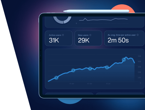
Small changes can make a big difference. Try these 14 quick SEO wins to boost your site's traffic, user experience, and conversions.
9902
•
18-min
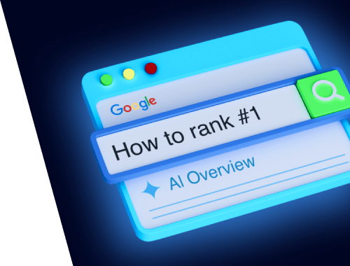
Google’s new guide cuts through the GEO and AEO noise. Here’s what really matters for AI Overviews: non-commodity content, query fan-out, snippet eligibility, and SEO fundamentals.
3815
•
12-min
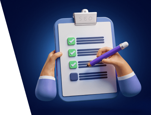
Get our free 2026 SEO checklist. Discover 40+ essential steps, from technical fixes to advanced LLM optimization for Google, ChatGPT, and Gemini, to boost your website's visibility.
135622
•
24-min