12
•
11-minute read


I recently came across a LinkedIn post by Cyrus Shepard about how Google defines content effort, and his main point surprised me: effort isn't the same as the amount of work you put into a page. That got me curious enough to look into it properly.
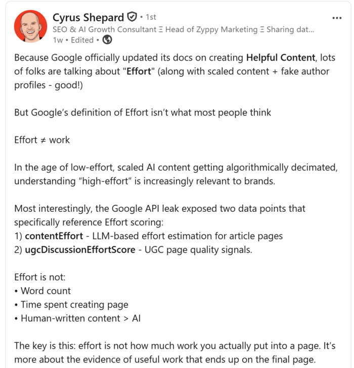
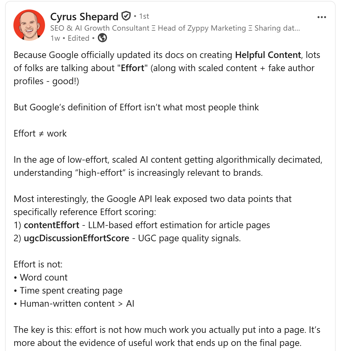
In early October 2026, Google updated its helpful content documentation to explain that raters judge a page's main content on four qualities: effort, originality, talent or skill, and accuracy. And the 2024 API leak had already revealed an attribute called contentEffort. What Google seems to care about isn't how many hours you spent writing, but whether the finished page shows real evidence of useful work.
Below, I'll walk you through what I learned and share a checklist you can use to review your own pages.


In Google's terms, content effort is the extent to which human work went into creating a page or the systems that power it. It's judged by what's visible on the page, such as original research, testing, or a useful tool, rather than by word count or the time it took to write.
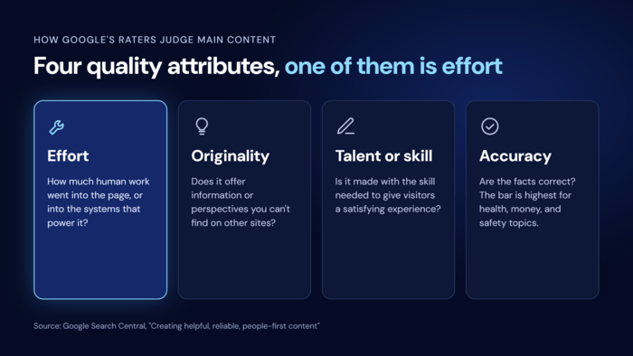
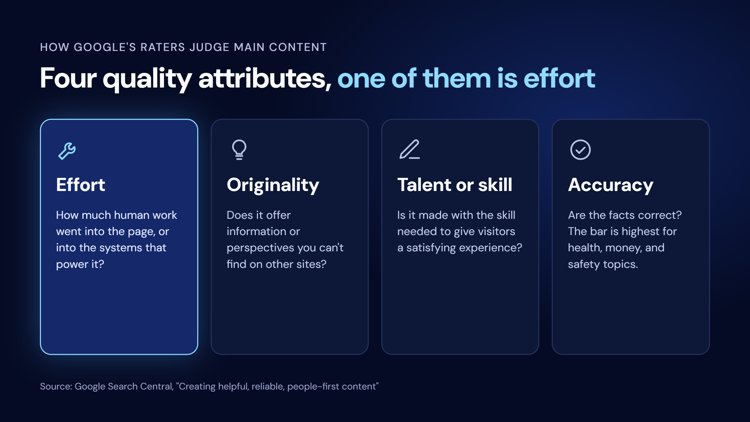
Effort can be direct, like someone writing original analysis or translating something by hand, or it can go into building what powers the page, such as a calculator or an interactive map. Google's examples of the opposite are pages generated automatically from feeds, or large amounts of AI-generated text published without anyone reviewing it. Google also notes that crediting your sources doesn't replace the need for original effort.
Raters assess effort alongside originality, talent or skill, and accuracy, and the four often overlap. The full criteria are in Google's Search Quality Rater Guidelines. Keep in mind that raters don't decide rankings. Their assessments help Google check whether its algorithms surface the right pages, so effort shows what Google's systems are trained to reward rather than being a factor you can tick off a list.
The 2024 Google API leak suggests effort isn't only judged by human raters. It revealed two related attributes: contentEffort, described as an LLM-based effort estimate for article pages, and ugcDiscussionEffortScore, a quality score for forums and other user-generated pages. Both sit among other page-level quality signals. If you want to dig deeper, Mike King's analysis of the leak is a good place to start.
What the leak doesn't tell us is how, or even whether, Google uses these values in ranking today. But it does suggest Google has worked on estimating effort automatically and at scale, which makes it worth taking seriously.
Most of the confusion comes from treating effort as hard work. A 4,000-word rewrite of the top 10 results is still low effort, however long it took, because nothing on the page is new. And hours that don't show up as something useful on the page are invisible to Google.
It isn't about human vs. AI writing, either. An AI-assisted page can be high effort if it's built on something automation can't produce, like original data, while a hand-written page can be low effort if it only repeats what's already out there.
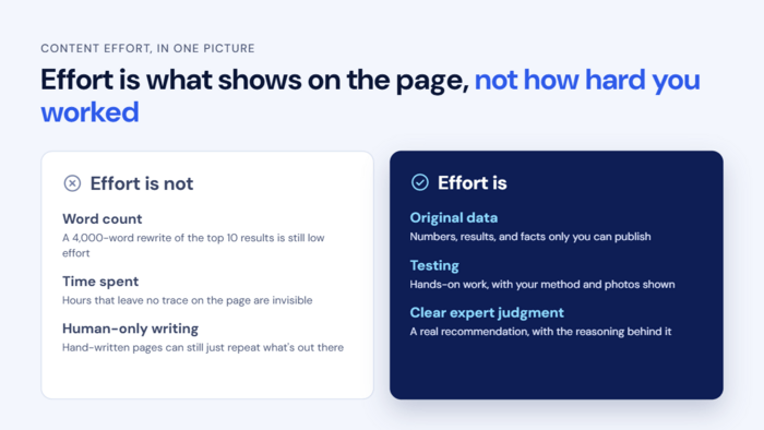
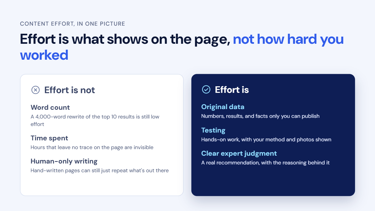
Effort only counts when it shows on the page, so the goal isn't to work harder but to make sure the work you already do leaves a visible trace. Here are seven ways to do that, with examples of what the difference looks like in practice.
The strongest signal of effort is information that exists only on your page. This doesn't have to mean a large research study, since most businesses already have useful data they never publish. Good places to look include:
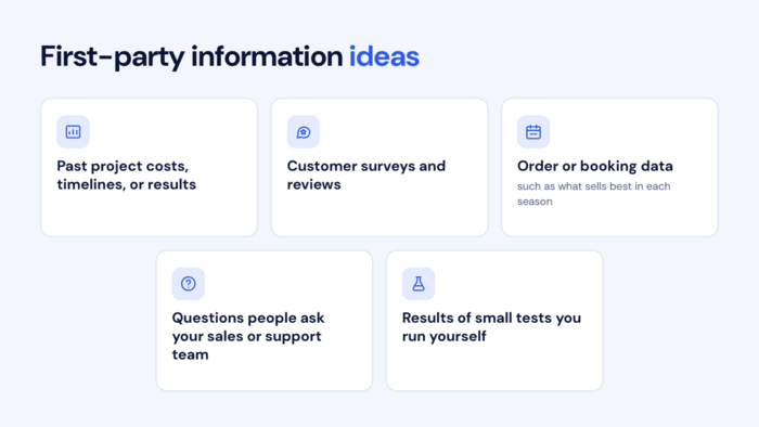
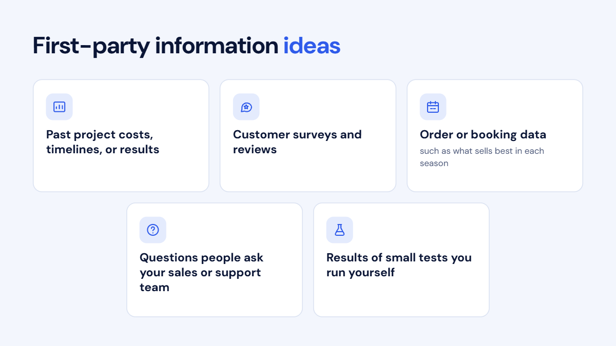
Take a home renovation company writing about "How much does a kitchen remodel cost?" Most articles on this topic repeat the same national averages. A version that breaks down the actual costs of the company's last 40 kitchen projects, by size and finish level, answers the same question with information no competitor can copy.
Small tests count too. A travel blog that times every airport-to-city transfer option, from the train to a taxi at rush hour, offers something a summary of other blogs never could.
Readers and Google both trust conclusions more when they can see how you got there. A short "How we tested" or "Where these numbers come from" box near the top of the page makes a big difference, and Google recommends the same approach in its guidance on writing reviews. The box usually needs only a few lines covering:
A personal finance blog comparing savings accounts, for example, becomes far more credible when it notes the date the rates were checked, says that fees were taken from each bank's published terms, and admits that the comparison only covers online banks. Being upfront about limits makes the rest of the page easier to trust.
We use the same approach in our case studies section, where SEO PowerSuite users explain which tools they used, what they changed, and what results they achieved.
Stock photos and recycled graphics are one of the quickest giveaways of a low-effort page. Your own visuals prove you actually did the thing you're writing about, and they come in many forms:
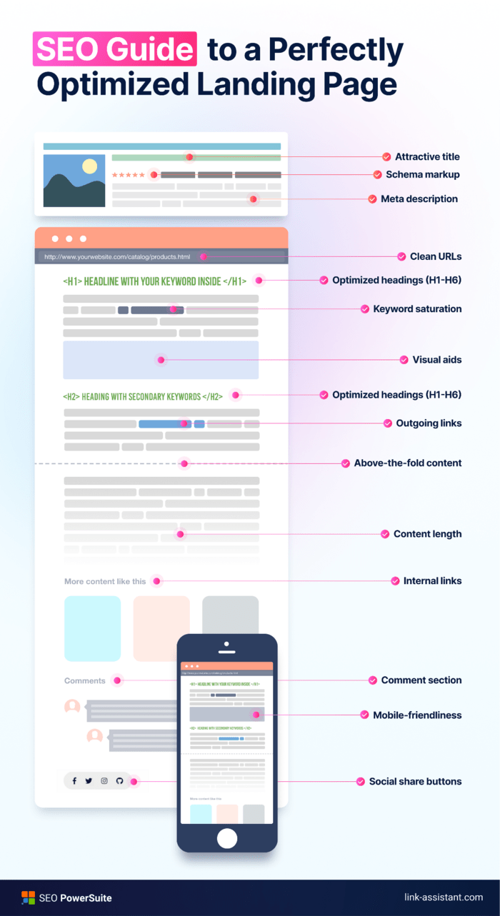
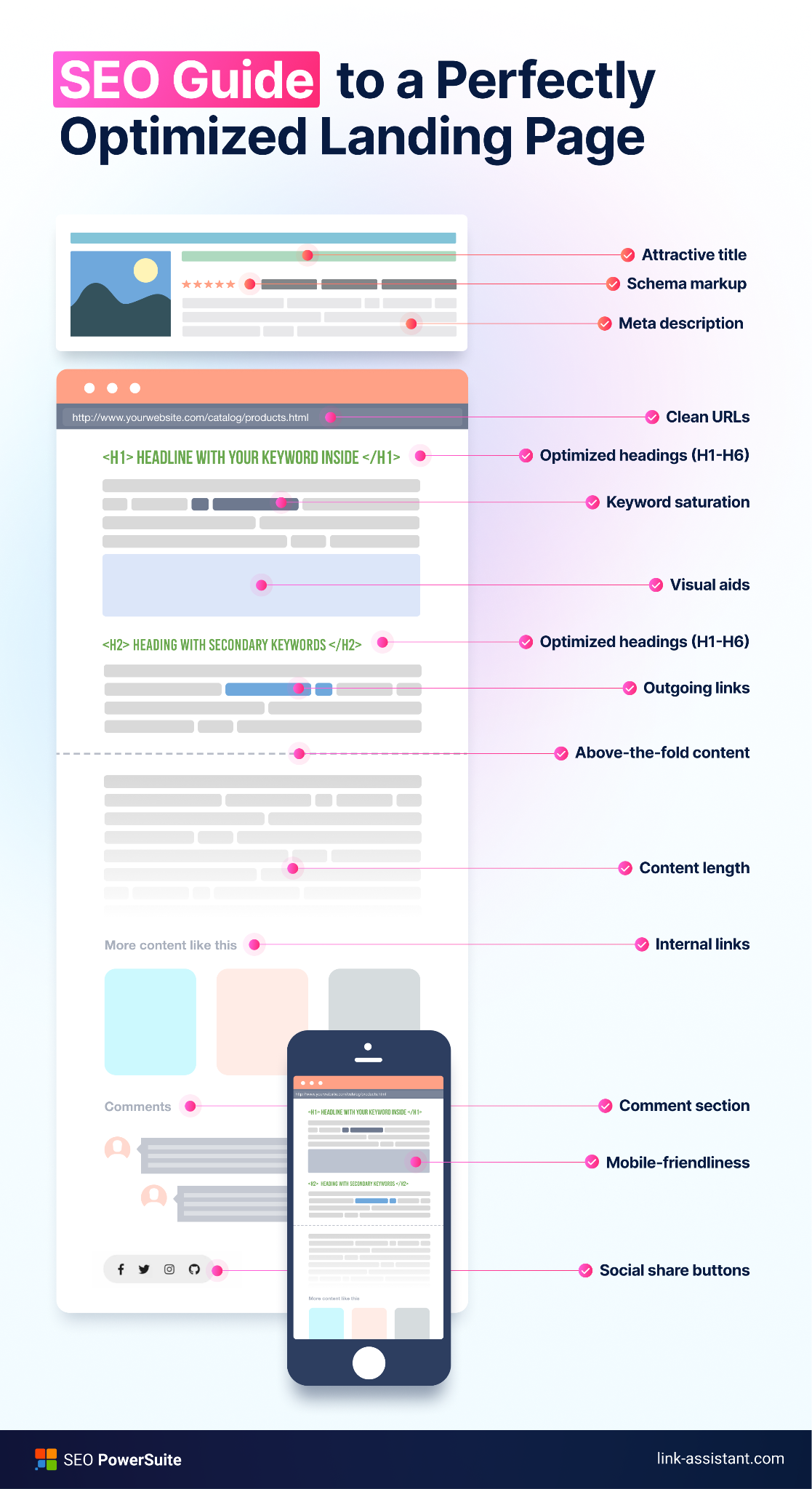
Original visuals also give people a reason to link to you. Our guide to a perfectly optimized landing page includes a custom infographic that maps every on-page element, from the title and schema markup to internal links and mobile-friendliness, onto a single page layout. It’s now one of the 20 most-linked pages on our blog.
A stock photo of a laptop would never have earned those links, because anyone can find the same image elsewhere.
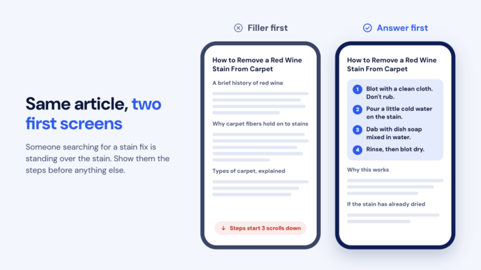
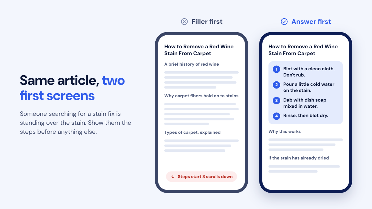
Google's rater guidelines specifically call out filler, meaning content that makes a page longer without making it more useful. The classic example is a how-to article that spends several paragraphs on background before getting to the point.
Someone searching "how to remove a red wine stain from a carpet" is probably standing over the stain right now. The first lines should tell them what to do immediately, with the explanation of why it works further down.
For pages where readers' situations differ, a quick decision table helps them find their answer fast, such as a travel guide showing which visa applies based on nationality and length of stay.
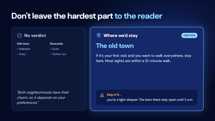
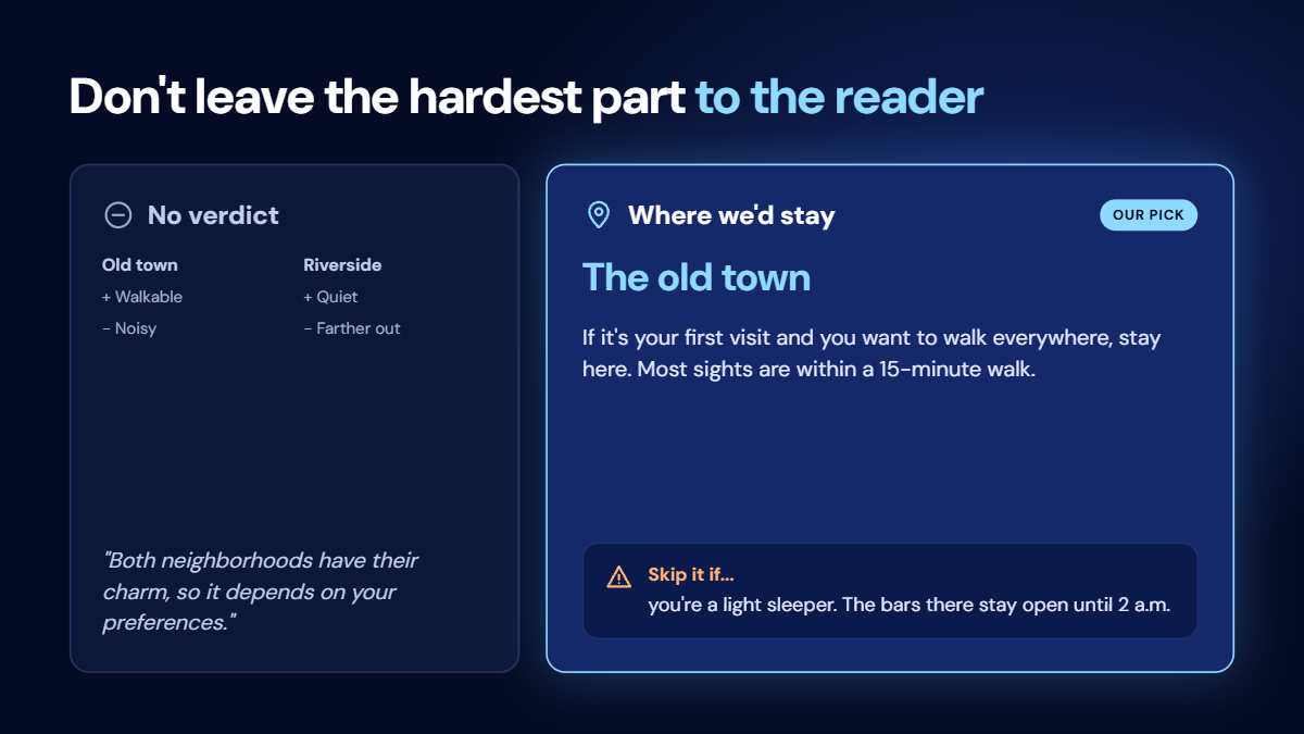
A page that lists pros and cons without reaching a conclusion leaves the hardest part to the reader. Effort shows when the author weighs the options and commits to a recommendation, including who it's not for.
Compare a travel guide that says "Both neighborhoods have their charm, so it depends on your preferences" with one that says "If it's your first visit and you want to walk everywhere, stay in the old town. Skip it if you're a light sleeper, because the bars there stay open until 2 a.m." The second one is more useful, and it's the kind of judgment an AI summary of other pages can't produce.
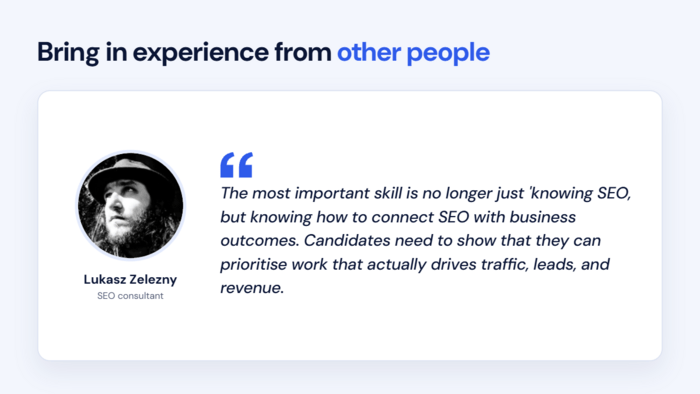
Quotes from practitioners, your own team, or customers add perspectives that don't exist anywhere else online. They don't need to be famous experts. A wedding venue's blog post on planning a reception gets much more useful when the venue's event coordinator explains the three things couples most often forget to budget for.
.png)
Real questions from your audience work well too. If customers keep asking the same thing in reviews, support chats, or on social media, answering those exact questions shows you're responding to real needs rather than to a keyword list.
Most articles on a topic cover the same basics, because they're all summarizing each other. Effort shows in the details that only come from hands-on experience. To find them, ask yourself:
A gardening guide on growing tomatoes usually covers sunlight, watering, and staking. A high-effort version also explains what to do when the leaves start curling in a heatwave, or how to get a decent harvest on a shaded balcony, ideally with photos of the author's own plants.
Knowing what high effort looks like is one thing, but most sites already have dozens or hundreds of pages written before anyone thought about it. The good news is that you don't need to review every page by hand. Tools can narrow the list down to likely candidates, and then your own judgment decides what happens to each one.
Low-effort pages often share technical traits that a crawler can spot. In SEO PowerSuite's WebSite Auditor, the site audit flags duplicate on-page content, which is a good starting point.
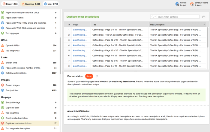
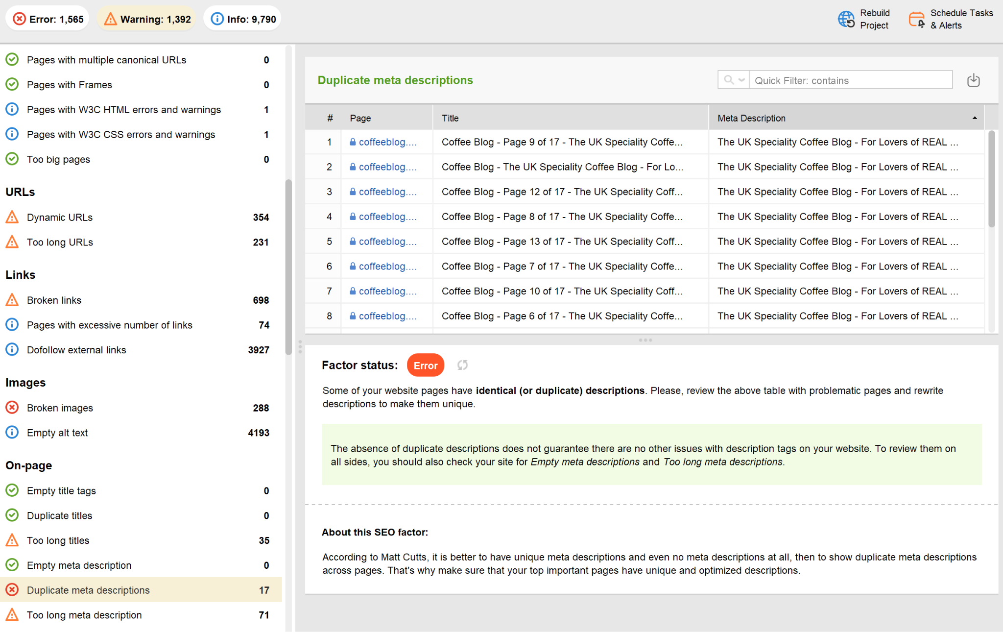
While revising websites, pay special attention to:
An online furniture store, for example, might find that 300 of its product pages use the same supplier copy as every other retailer selling those sofas. A cleaning company might find 40 city pages where only the city name changes.
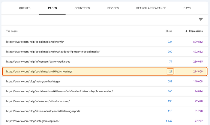
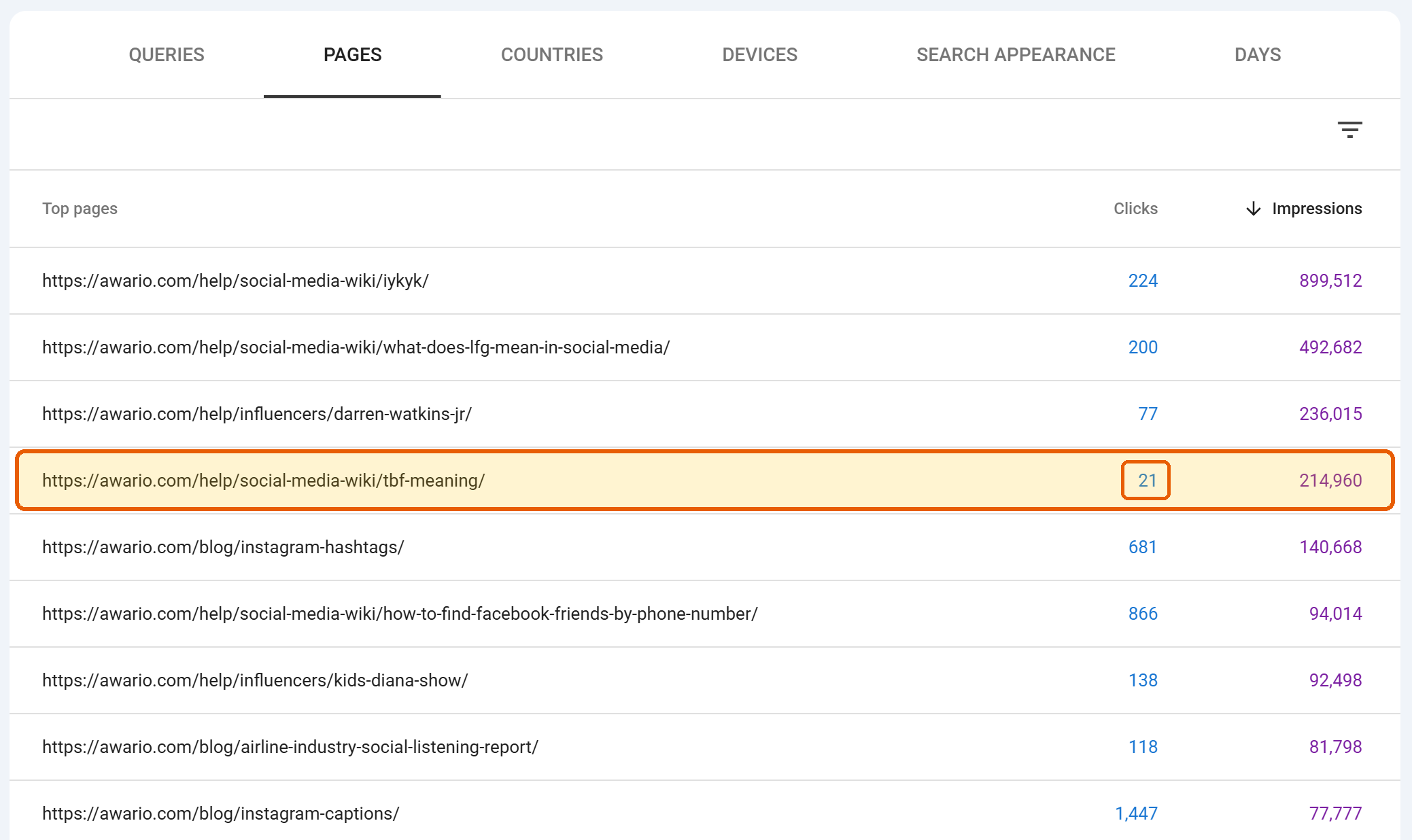
A thin page isn't automatically a problem, and a page that looks fine might be quietly underperforming. Google Search Console shows you how Google itself treats your pages, which helps you decide where to focus first. Two reports are especially useful:
Pages that get impressions but few clicks are usually the best place to start. Google already considers them relevant, so they often just need more substance.
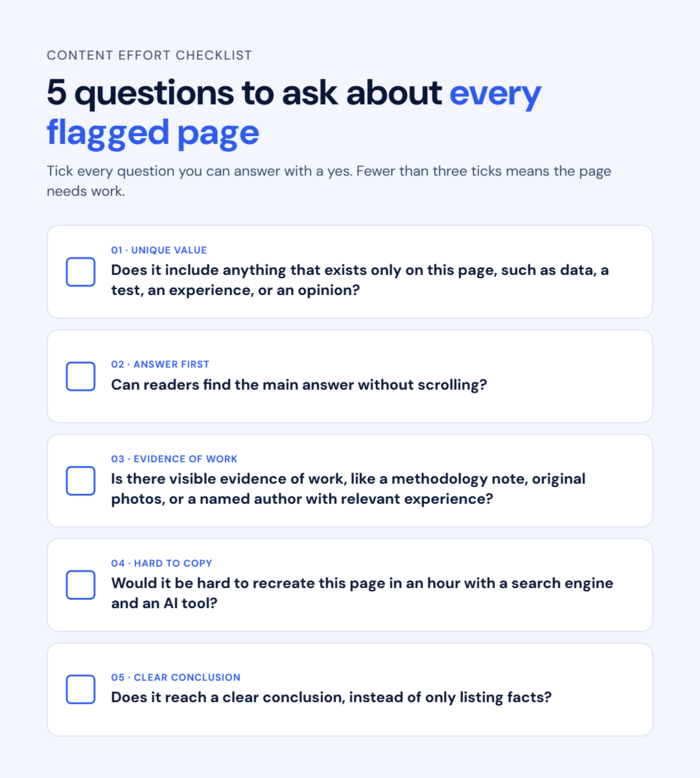
This is the part a tool can't fully do for you. For each page on your shortlist, ask:
If a page fails most of these, it's a strong candidate for one of the fixes below.
@1x.png)
AI is useful as a second reader here. Paste the page text into an assistant with a prompt like: "Go through this page and point out every claim, example, or detail that a reader couldn't find in the top search results for this topic. Then list which parts are generic."
If the first list is nearly empty, you have your answer. Just treat the result as a starting point, not a verdict.
Not every low-effort page should be rewritten. Some are worth improving, some are better combined with others, and some simply don't need to exist. As a rule of thumb:
When improving a page, RankDots can help you see which subtopics competitors cover that you don't, and draft a starting structure.
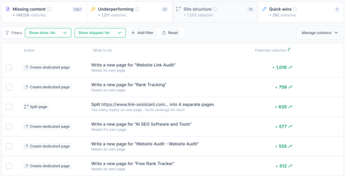
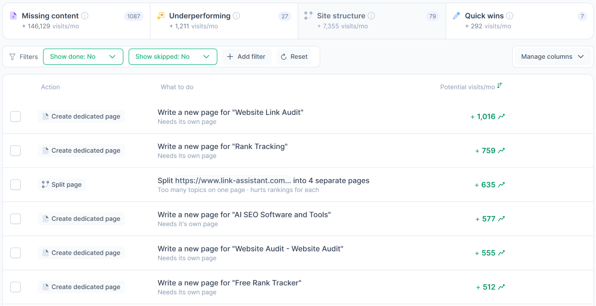
Keep in mind that a draft only gives you the outline. The effort comes from what you add to it: your data, your photos, your team's experience, and your own conclusions.
Use AI to find what to add, not to write it. Paste in your customer reviews, support emails, or sales call notes and ask which questions come up most often.
A pet supply store, for example, might discover that buyers of a particular dog crate keep asking whether it fits in a car. That's exactly the kind of detail worth adding to the product page, ideally with a photo showing the answer.
One last caveat: improving a page is usually safer than deleting it, especially if it already ranks or has links pointing to it.
The idea behind content effort isn't complicated, even if the name is a bit misleading. Google doesn't need you to spend more hours on every page. It needs to see something on the page that couldn't have been put together from other search results in an afternoon.
That matters even more now that AI answers can summarize common information in seconds. Pages that only repeat what's already out there are the easiest to replace, both in search results and in AI-generated answers. Pages built on your own data, experience, and judgment are much harder to replace.
You don't have to fix your whole site at once. Start with a handful of pages that already get impressions, run them through the five questions above, and add the one thing only you can offer.


 Article stats:
| Linking websites | N/A |
| Backlinks | N/A |
| InLink Rank | N/A |