9699
•
18-minute read


Running a site doesn't always mean big overhauls — sometimes one small tweak moves the needle. Below are 14 quick SEO wins you can ship today — fixes that pay off across rankings, conversions, and UX at the same time. Let's dig in.
Ranking on Google and getting quoted by AI are now two different games. AI Overviews show up on roughly a third of searches, and ChatGPT, Perplexity, and Gemini don't hand users ten blue links — they return one synthesized answer. You can sit at position 3 and still be invisible inside it.
The good news is you don't need a 'GEO strategy' or a six-month overhaul to start showing up. Some of the best quick SEO wins right now are simple content edits, and a few of them get you most of the way. Here's where I'd start:
Lead with the answer
AI pulls clean, self-contained answers straight from the top of a page. So answer your page's main question in the first sentence or two, then expand.
Compare: "In this guide, we'll explore everything you need to know about topical authority…" and "Topical authority is the trust a site earns by covering one subject in depth. Here's how to build it." The second one is what gets quoted.
Write in chunks AI can quote
Comparison tables, plain-language definitions, and standalone stat sentences are the formats that get cited most, because they're pre-packaged answers. Comparison guides and definition pages are heavily cited in AI answers because they mirror how models structure information.
Use real questions
Genuine questions in your customers' words, answered up front, still help AI parse your page. But don't add FAQ schema expecting those expandable dropdowns: Google announced it would drop FAQ rich results in June 2026.
The markup is fine to leave on the page, it just doesn't earn a SERP feature anymore. And if a question has real search demand, give it its own focused page rather than burying it in a 15-question accordion — AI tends to cite tight single-topic pages over sprawling FAQ blocks.
If you're not sure what content to make for AI to cite, a tool like RankDots can give you a starting point. It groups your keywords into topic clusters and shows which subtopics you haven't covered yet.
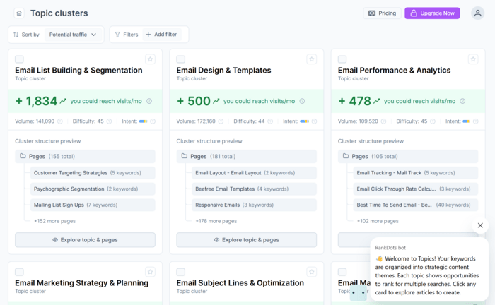
That makes it easier to spot the comparisons and definitions actually worth adding.
Headlines and subheadlines are the first things people see once they land on a page. That’s where you can either grab their attention or fail to do so.
Here is a quick test to see if your headlines are good: Imagine your website would be just your headline, subheadline, and a call to action. Then ask yourself: “Would anyone understand what my service/product is about and take action just based on my headline?”
If yes, don’t touch your headlines. If not, consider fixing them.
However, there is a disclaimer part: Change your headlines only after a successful A/B test. Otherwise, you risk lowering your conversion rate instead of raising it.
While you can certainly get all creative with your headlines and subheadlines, it's important not to lose sight of the following rules:
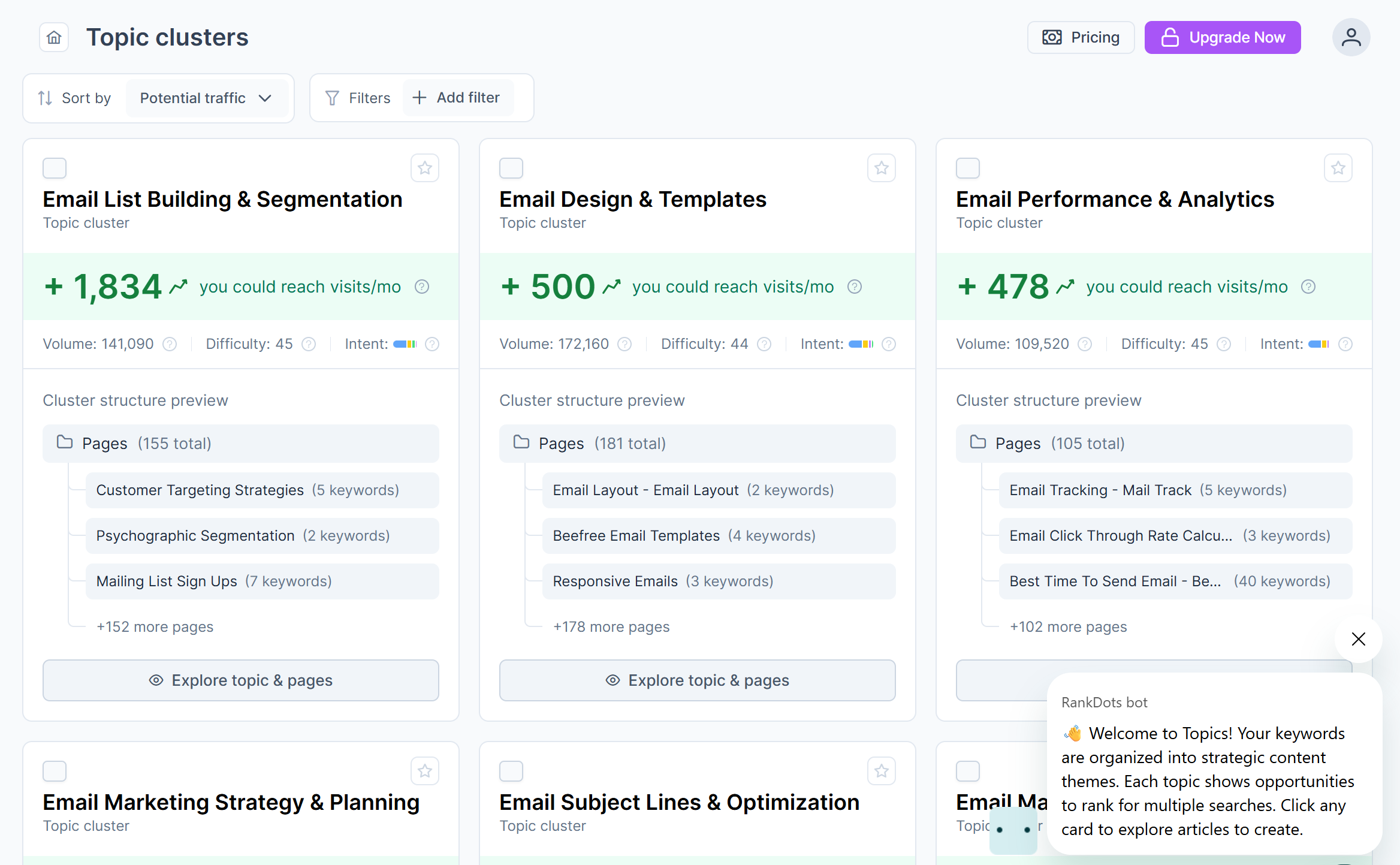
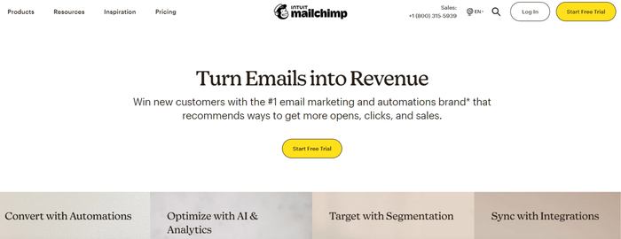
Let’s see a couple of good and bad examples in the wild. The good ones:

Mailchimp benefits from all the above-mentioned rules: there are USP (#1 marketing and automation brand), power words (win, more, revenue, sales), and keywords (marketing, automation).
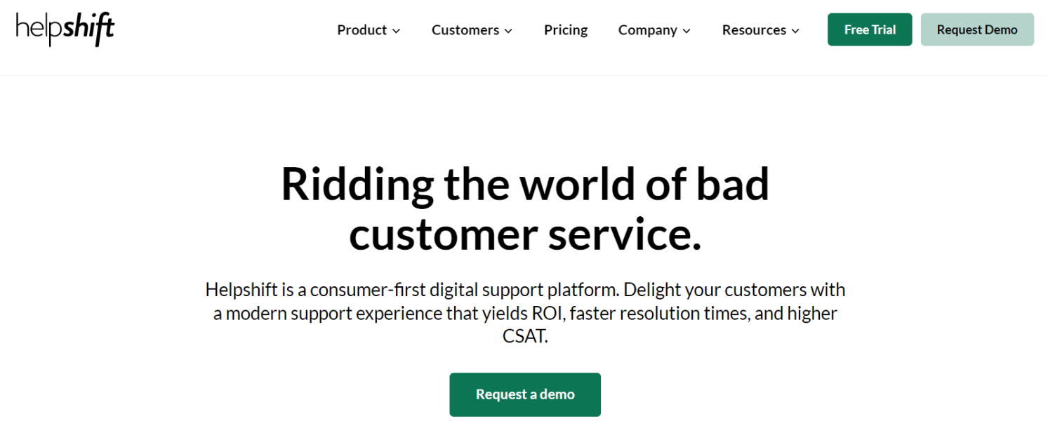
Helpshift does pretty much the same: it sends strong messages, mentions benefits users will get, and is optimized for search engines.
Now let’s move on to the bad examples:
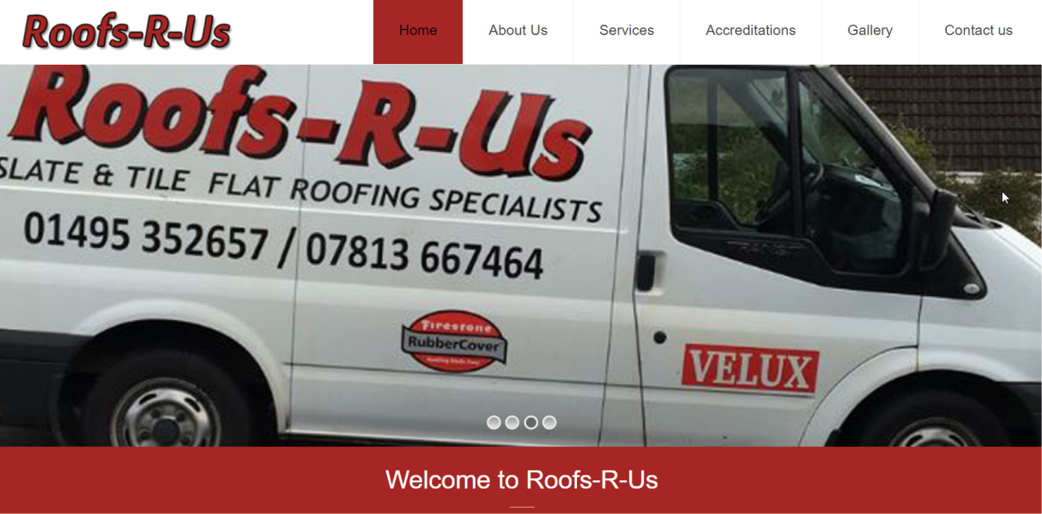
Here, there is no headline at all, except for the plain welcome text marked as H2.

What's wrong with this landing page? The name of a company or service isn’t the best headline for the homepage. It doesn’t communicate your message as a business. Placing a product/service name in the upper left corner is quite enough.
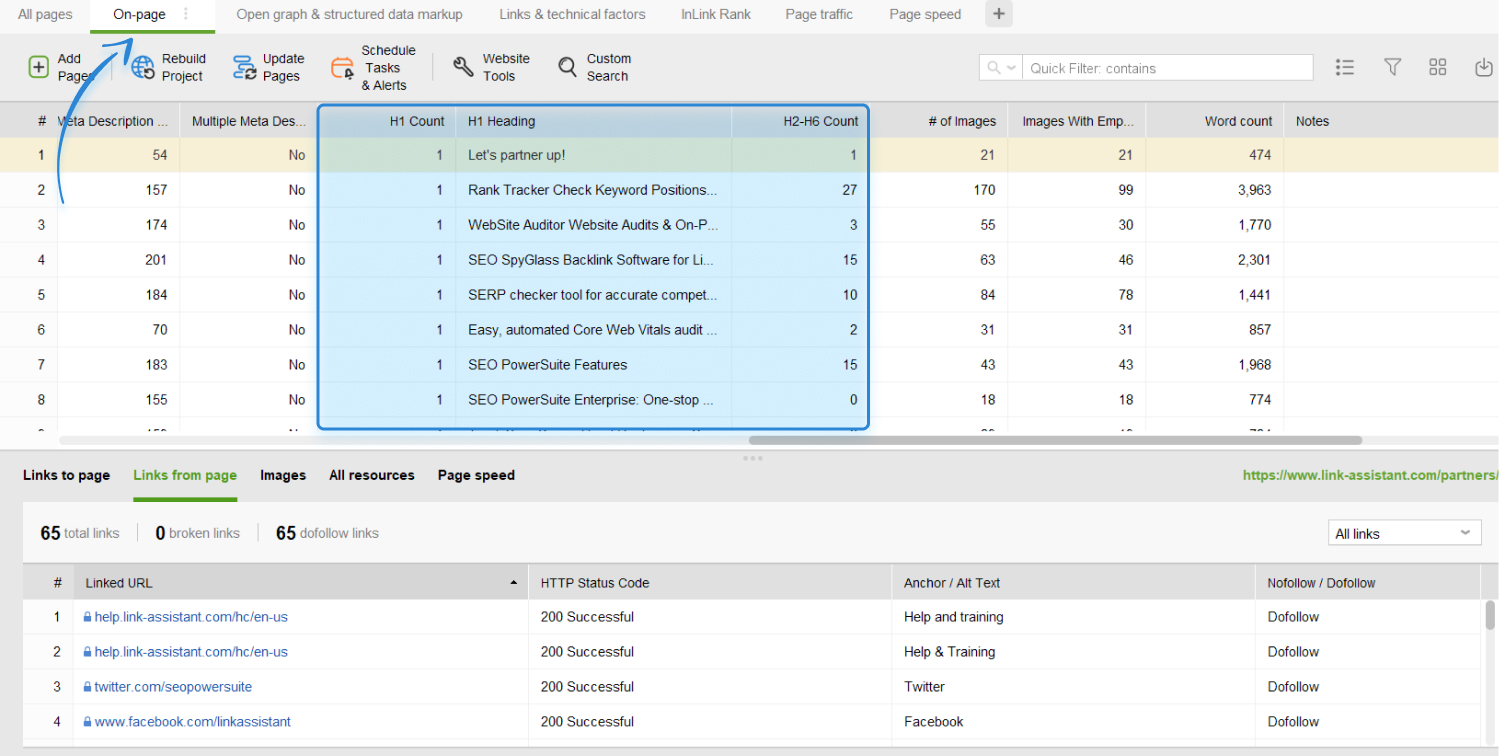
H1 - H6 tags help to structure content on a webpage and make it more readable and accessible to users and search engines.
And while improved accessibility and better UX and SEO sound like something we all wouldn’t mind getting, it makes sense to pay due attention to these semantic HTML tags.
What I mean:
Clean, well-ordered headings also help AI tools work out which part of your page answers what — useful now that they quote pages directly.

Download WebSite Auditor
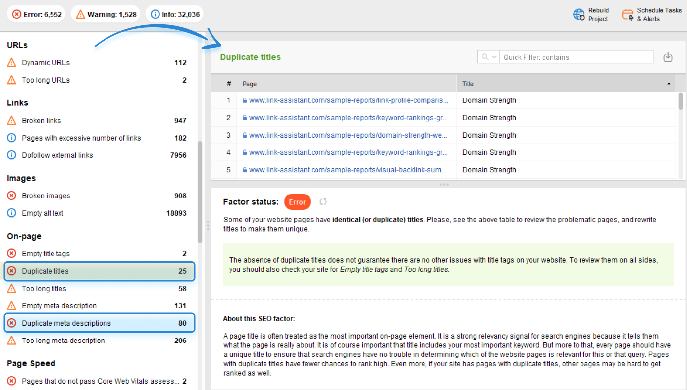
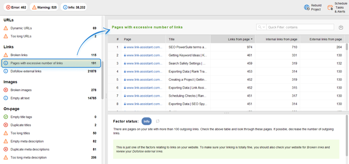
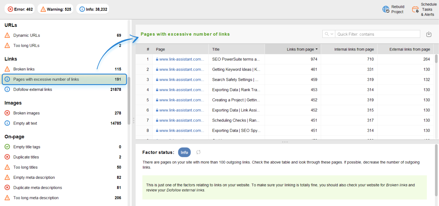
Google considers multiple pages with the same title tag and description as duplicate content. And the duplicate content issue is not a joke.
Duplicate titles and descriptions can negatively impact SEO because search engines will likely struggle to determine which page is the most relevant. This potentially results in lower rankings of the competing pages and a waste of your site’s crawl budget.
Besides, duplicates can lead to inaccurate representation on SERPs, resulting in lower click-through rates and fewer visits. It's important to ensure that each page on your website has a unique and relevant title and description to improve SEO and attract more traffic.
Here is how to detect the issue and quickly fix it:

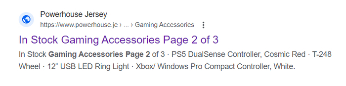
For example, such duplicates may appear due to pagination. The issue is easily fixed by adding the page number to the title and meta description:

It may seem like the design and placement of a call to action is such a small, almost insignificant thing. But it’s not. There are case studies that claim that improving CTAs can result in a breathtaking conversion boost.
Conversions, however, aren't the only thing that CTAs affect. A well-designed and properly placed CTA makes it easy for users to find and complete the desired action. That, in turn, reduces frustration and creates a more positive user experience.
There is even more. Many CTAs are designed to collect user data, such as email addresses or demographic information. Skillfully planned CTAs can help you collect more valuable data that will help improve your marketing strategy in the future.
Disclaimer: Don’t blindly change your site’s CTAs. A/B testing is necessary before making any fixes. Also, use all kinds of click maps to analyze if users are clicking on your CTA buttons.
So what makes a CTA irresistible?
In brief, at the awareness stage, CTAs should be placed on a home page, landing pages, and blog posts, encouraging users to sign up for your email list or download a free resource.
At the consideration stage, CTAs should be placed on product pages and in emails, encouraging users to learn more about your products and consider making a purchase.
Finally, at the action stage, CTAs should be placed on the purchase page and in confirmation emails, guiding users to complete their purchases.
Let’s compare good and bad examples. The good ones, to my mind:

The CTA is concise and clear and of the same type throughout the landing page.
Here is what I consider not the best-executed CTA:


The wording is inspiring but what should I expect, where do I go if I click? It is a bit unclear.
Here is another not-the-best approach to CTA placement:

There are too many CTAs per page. As a user, I’m confused.
A 404 page is a web page that appears when users try to access a URL that does not exist or is broken. As a rule, users see this plain 404 Not Found text in black and white. This page may become their journey's endpoint.
But a solution exists – a custom 404 page that redirects visitors to relevant content and helps them navigate through your site. Such a page can improve UX and prevent users from leaving your site.
How do you make a perfect custom 404 page:
Now let’s see some examples starting with the best ones:

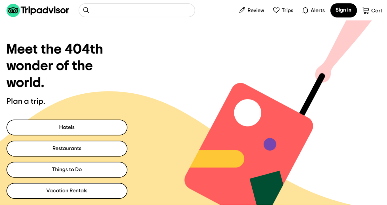
Tripadvisor placed creative text and added a couple of navigation buttons to direct people to useful pages.
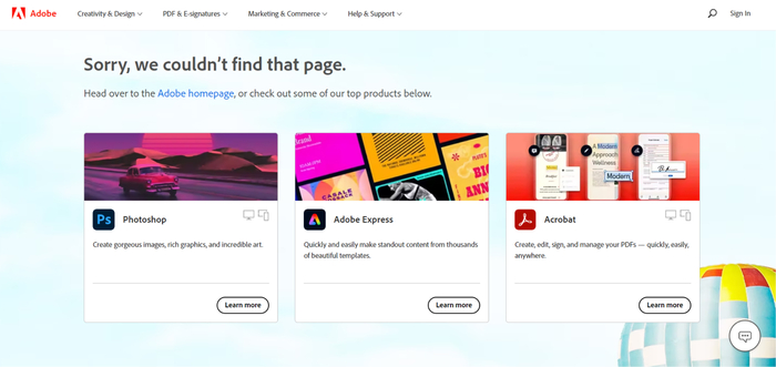

Adobe did a great job placing product banners on the page and providing a link to the homepage.
Here are the examples of sites that didn’t take care of UX and CRO:
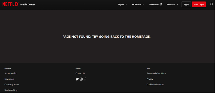
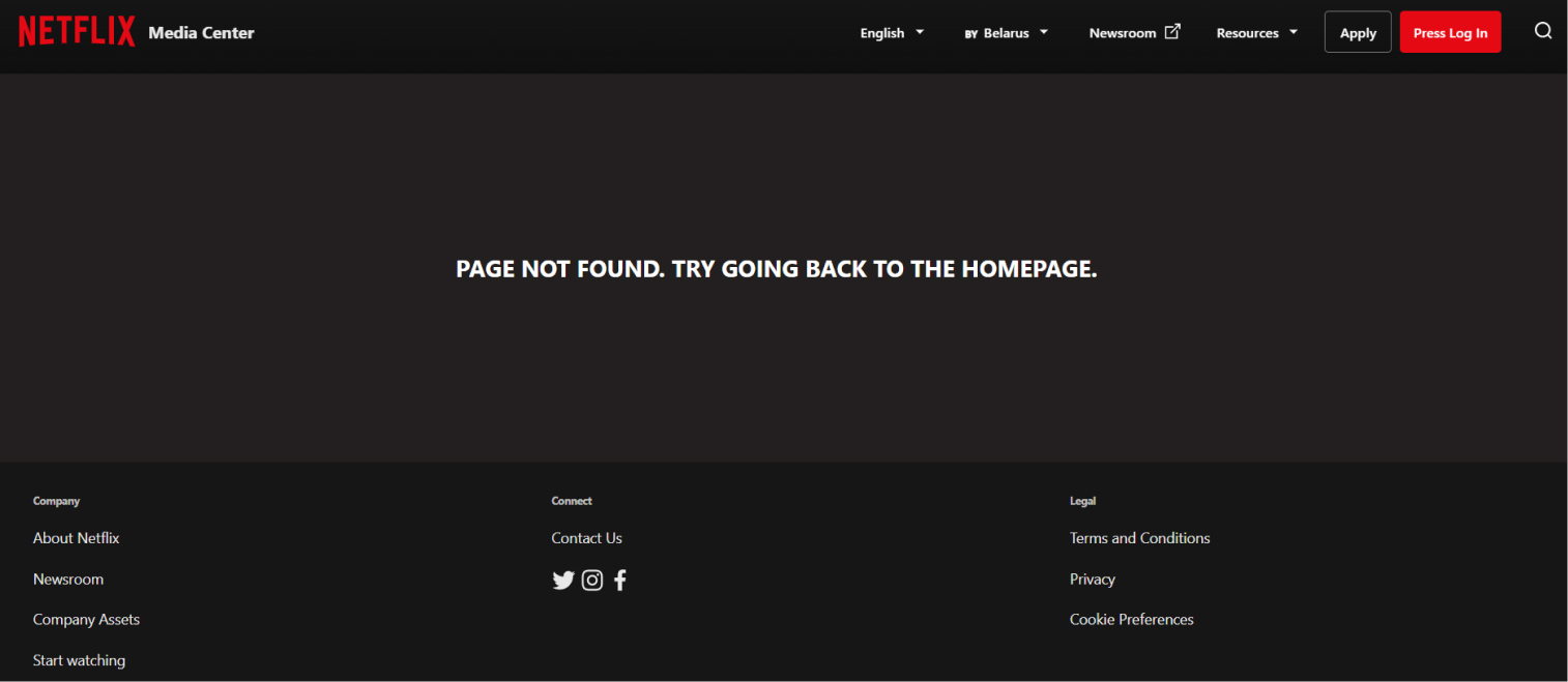
Netflix could do better. There is no creativity, no care for user experience.
Here is another example, rather interesting but not beneficial for your site:
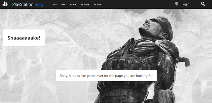

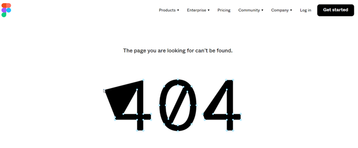
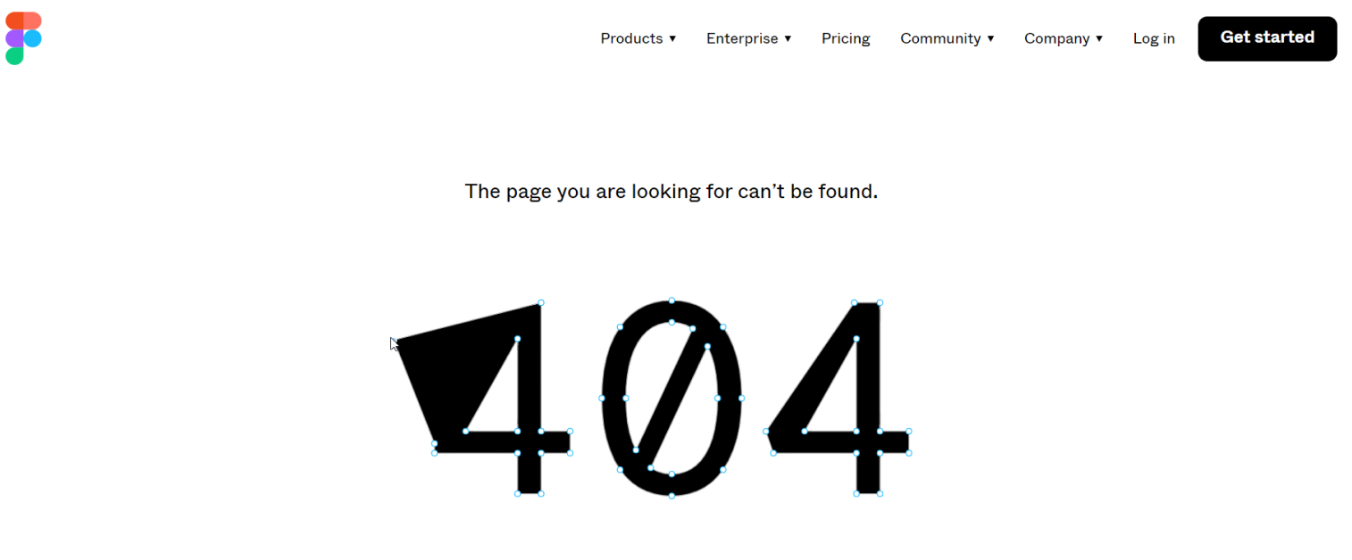
Figma created an interactive 404 page. Genius idea, but not CRO-friendly, though.
You must have done internal linking for the sake of PageRank distribution and building topical authority. But have you ever tried linking to your high-converting pages from traffic-heavy, backlink-rich pages? I promise it will boost your conversion rates.
First, make a list of converting pages (Excel will do) – product pages, blog posts, and service pages. Consult Google Analytics to find ones. Then think through where you can place these links:
Remember, the key is to ensure that the internal links to your converting pages fit naturally into the context of the page and provide value to users.
Download WebSite Auditor
People mention your brand, your product, or your research all the time without linking to it — in roundups, blog posts, forum threads, social posts. Each one is a link you've basically already earned. You just have to ask. It's one of the fastest SEO wins in this whole list: nothing to create, no pitch to invent, just a short, friendly note. Here's an example:
Subject: Thanks for the mention
Hi [Name],
I just read your post on [topic] and really liked the point about [specific detail]. Thanks for mentioning [Brand] in there.
One small thing: the mention isn't linked, so readers can't click through to find us. Would you mind adding a link to [URL]? No worries at all if it doesn't fit. Either way, I appreciate the kind words.
Thanks, [Your name]
You can use a brand monitoring tool like Awario to track your brand name, product names, and key people across the web and social.
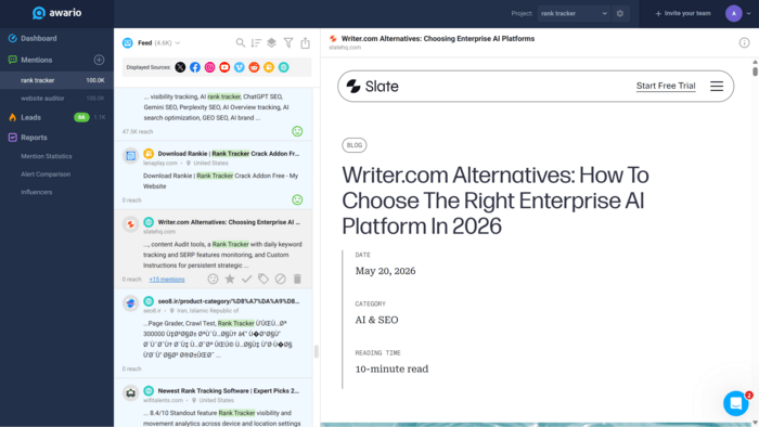

The same monitoring shows you where your brand turns up in AI answers and in places like Reddit and niche forums, which increasingly shape what those answers say. If ChatGPT or an AI Overview is describing you wrong, or skipping you entirely, that's a signal about which pages and mentions to shore up next.
Trust badges are visual indicators that a website has undergone some form of verification or certification, indicating that it is secure or popular.
If a website is new or relatively unknown or deals with sensitive information, trust badges can help increase users’ confidence in your biz. That may result in improved conversion rates and reduced bounce rates.
But what badges should you add?
To add trust badges to your site, you will need to find the badge image from their providers, copy its code, and paste it into your website's HTML. Or you can use a special plugin or app that enables easy badge integration.
Here is my favorite example of trust badges placement:
User-generated content (UGC) refers to any content that is created by users of your website, such as reviews, comments, and social media posts. It has many benefits: UGC establishes trust with your audience, creates a sense of community around your brand, and provides social proof for your products or services.
Let’s not forget that UGC can also help to increase the number of long-tail keywords that a website ranks for. This, in turn, can improve its visibility in search results.
Solid reasoning to think of adding some UGC, right? Now, let’s see how you can approach this:
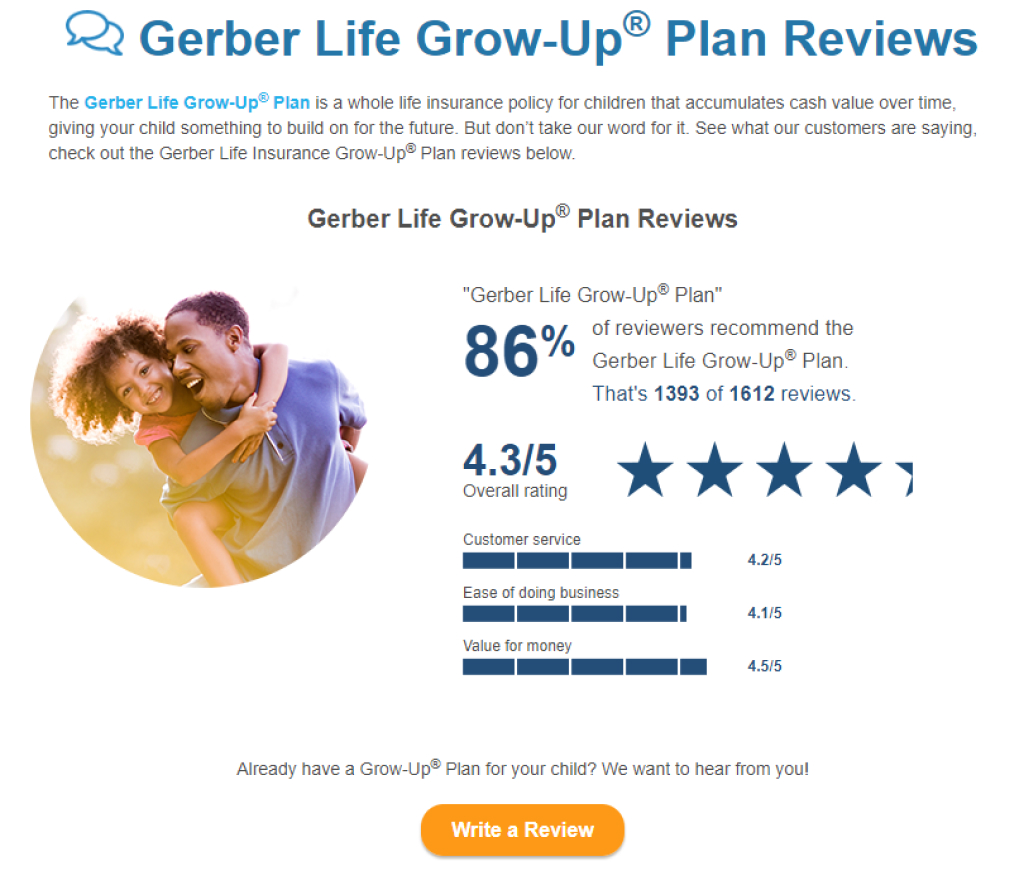
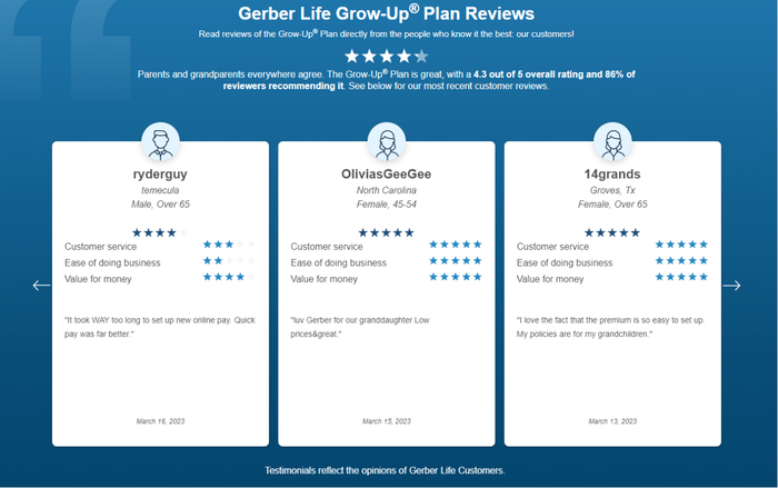
Now, let’s see some real-life examples. This is how Gerber Life Insurance encourages clients to write a review:

And then they share these reviews on their site:
Amazon, for example, uses UGC not only to display it on their site but also as a way to help users sort through products. They have a feature called Request Review which sends an email to customers after they make a purchase, asking them to rate and write a review about the product. The average rating is shown on the product page, and customers can choose to see the highest-rated products.
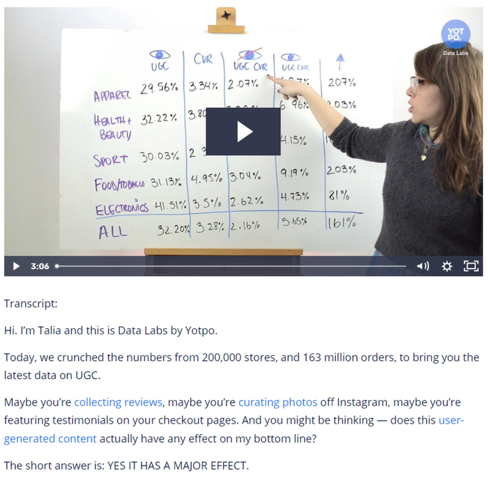
A transcript is a text version of the audio or video content, which makes it accessible to users who are hard of hearing. Non-native speakers who find it difficult to grasp spoken language will also appreciate the effort. Besides, transcripts can also improve the SEO of your website by providing additional text for search engines to crawl and rank.
So, if you use such type of content, consider adding a transcript. Here is how to approach this:
Here is what it may look like on a page:

Though it seems trivial, it's one of the easiest SEO wins here.
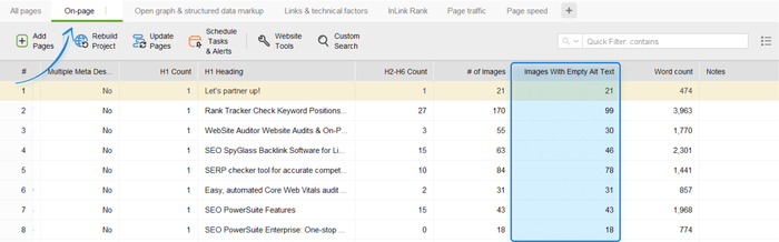
When search engines crawl a webpage, they cannot "see" images in the same way that humans do. They rely on alt attributes along with their computer vision algorithms to understand the content of the image. By providing relevant alt text for your images, you improve your chances of ranking well in search results, including image search.
Additionally, alt text can improve the accessibility of your website. For users who are visually impaired and use screen readers, alt text helps grasp the content of the image and the overall message of the webpage.
So, how to write alt text correctly:
Pay attention, it's easy to describe a pic like this:

It will be something like “a cup of coffee placed on a table”. But how would you describe this:
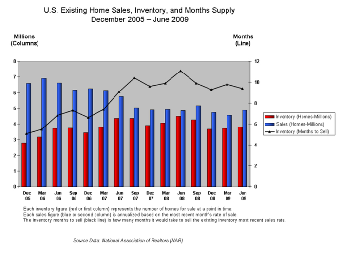

It’s incorrect to write an alt text like this: “home sales, inventory, and months supply chart”. People who use a screen reader would never get the point. The right alt text would be “home sales chart that shows a decline in home sales from January to February 2009, followed by a slight increase in March”.

Download WebSite Auditor
By keeping your content fresh, relevant, and informative, you can attract more visitors, improve your SEO, attract new readers, and maintain credibility in your industry.
So, you need to update old/declining posts at least once in a while. For that:
During your site audits, you may notice that there is unnecessary content that no longer serves its purpose or adds value to your website. Such content can be deleted for sure.
However, make sure this unnecessary page doesn’t have many incoming links (internal or external). Otherwise, choose redirection or page update. Read more about effective content pruning in our guide.
Structured data, also known as Schema markup, is a semantic vocabulary of standardized tags that are added to the page’s HTML. These tags help a search engine understand the content and context of your web page and better represent it in search results.
How do you work with structured data:
Small changes can make a big difference. Try these 14 quick SEO wins — with no rush, and with a bunch of A/B testing and SEO audits — and I'm sure you'll see positive changes.
If you have more ideas for quick fixes, share them in our private Facebook group.