43400
•
13-minute read


Running an online store is one thing. Getting people to find it? That’s another story.
If you want consistent, high-intent traffic without burning through your ad budget, SEO is how you get there. Specifically: ecommerce SEO — the process of optimizing your online store so it shows up in search results when people are ready to buy.
In this guide, we’ll break down ecommerce SEO step by step — from keyword research and site structure to technical fixes and content strategy — with a clear focus on what actually works today.


And if you're wondering how to implement all of this, we’ll show you how to do it using SEO PowerSuite, a toolkit that handles everything from audits to rank tracking — without the enterprise price tag.
Let’s dive in.
At its core, ecommerce SEO is the process of optimizing your online store to increase visibility in search engines — especially for the products and categories you sell.
The goal? Get your pages to appear when people search for what you offer, whether it’s “best noise-cancelling headphones” or “women’s waterproof hiking boots.”
But here’s the catch: ecommerce SEO comes with its own set of challenges. It’s not the same as optimizing a blog or service website.
Most ecommerce platforms don’t make SEO easy. That’s why having the right tools matters.
SEO PowerSuite gives you full control over crawling, indexing, and content issues — without relying on developers or paid apps.
Use WebSite Auditor to run full-site audits and catch duplicate content, broken links, missing meta tags, and crawl issues.

Use Rank Tracker to find ecommerce keywords and monitor how your product and category pages are performing over time.
And if your site structure needs attention, WebSite Auditor’s visualization tools make it easier to spot structural problems that could be holding your SEO back.

Good SEO starts with good research — but in ecommerce, you’re not just looking for traffic. You’re looking for buyers.
That’s why keyword research for ecommerce needs to focus on commercial intent — the kinds of searches people make when they’re actively shopping or comparing products.
Let’s break down the process.
Before you start building out content or product pages, it’s important to know what kinds of keywords you’re targeting.
Step 1: Start with seed terms
Think like a shopper. What would you search for if you were looking for your own product?
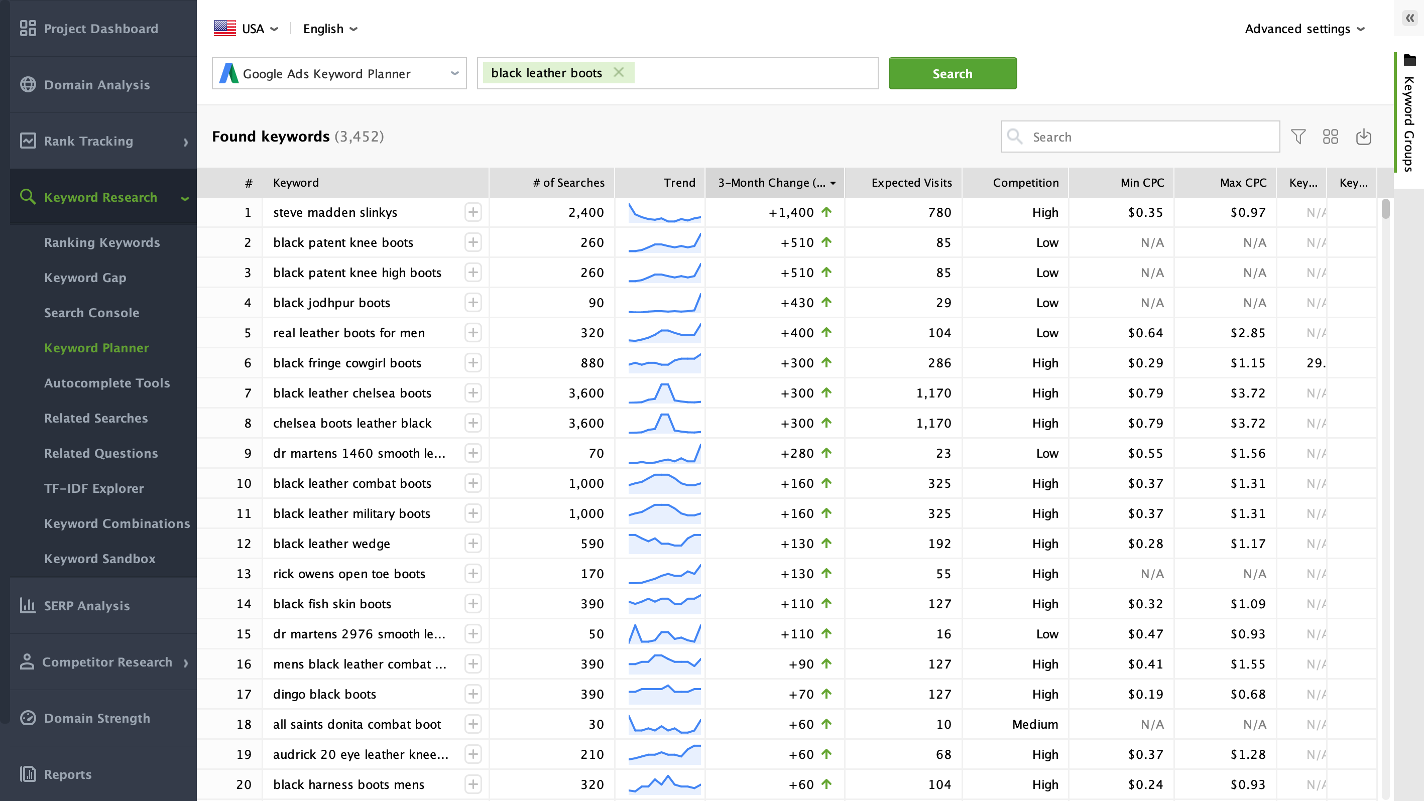
Step 2: Expand with keyword tools
Use keyword tools to find variations, long-tail terms, and search volumes.
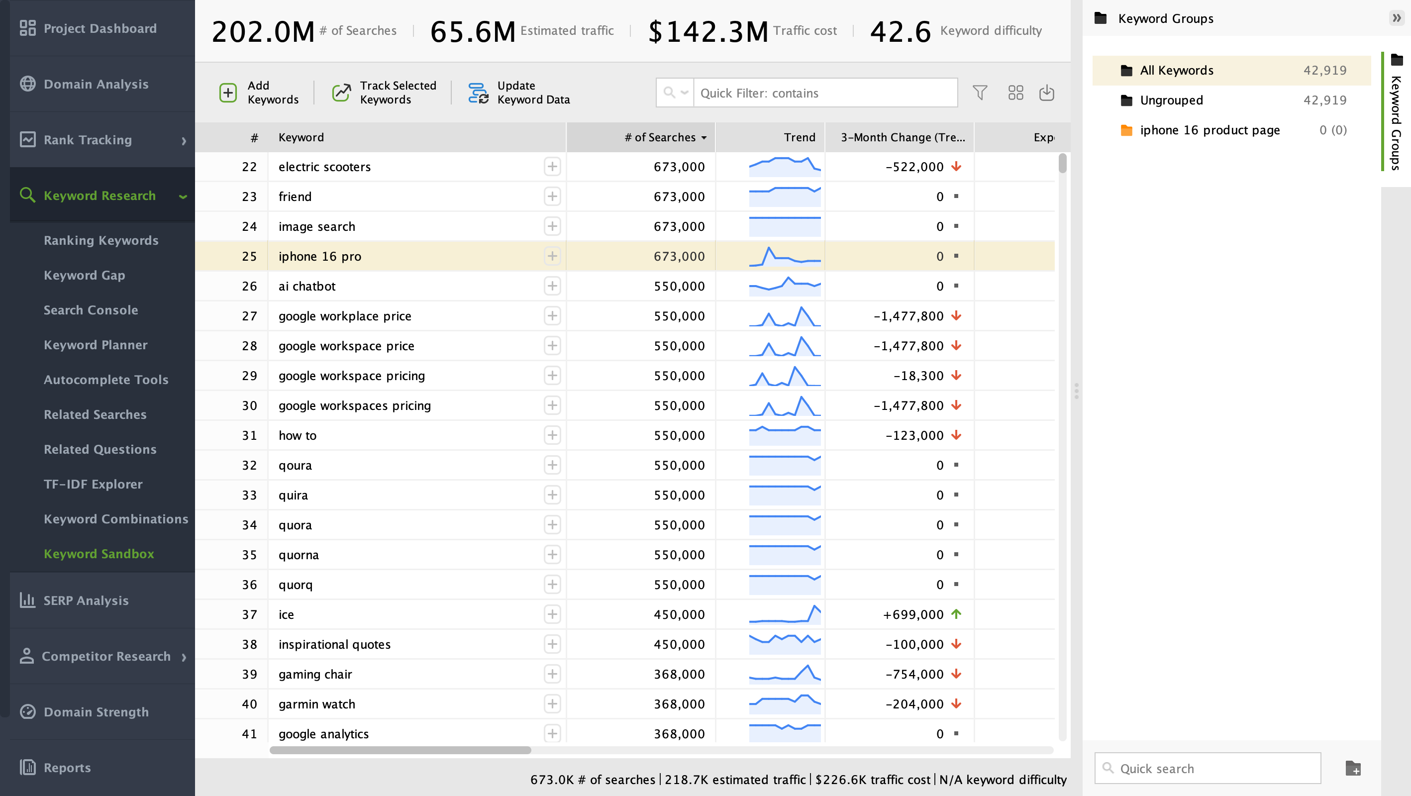
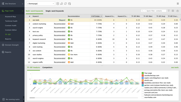
With SEO PowerSuite's Rank Tracker, you can enter your seed terms and get keyword ideas from multiple data sources — Google Keyword Planner, autocomplete suggestions, related queries, and more — all in one dashboard.

Step 3: Filter by commercial intent
Not all keywords are created equal. Look for terms that show clear buying signals (brand names, model numbers, “best,” “buy,” “vs.”, etc.).
Step 4: Check difficulty and ranking potential
Volume isn’t everything. You want keywords with high intent, low competition, and strong alignment with your products.
Rank Tracker gives you keyword difficulty scores and lets you preview the current top 50 results — so you can quickly identify opportunities where you can outrank weaker pages.
To check the SERP for a given keyword, go to SERP Analysis:
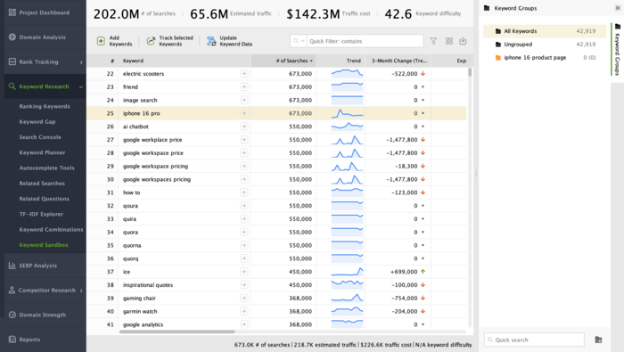
Step 5: Group keywords by page type
Don’t scatter keywords across random pages. Assign product-focused terms to product pages, broader terms to category pages, and questions to blog content.
You can easily group keywords in the Keyword Sandbox module. Select the required keywords and simply drag them to the keyword group you need.
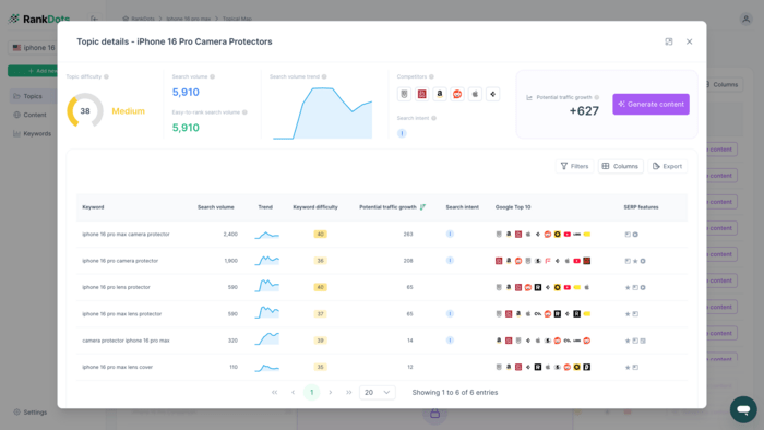
Google no longer ranks single keywords in isolation — it ranks topic coverage. That means the more comprehensively you cover a subject, the better your chances of ranking.
RankDots helps you group keywords by search intent and topic, so you can build entire clusters around your product categories and rank with purpose.
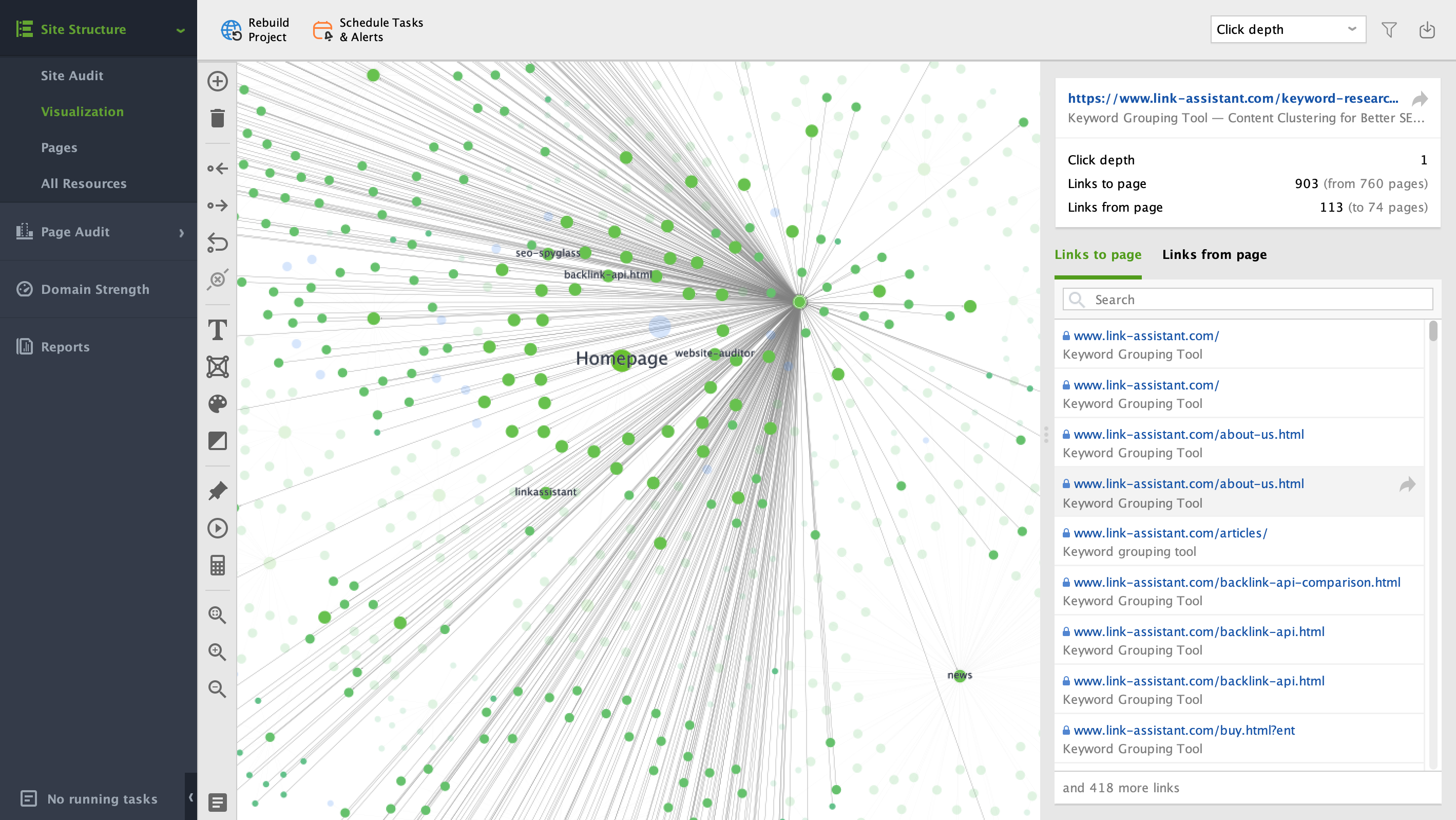
Your ecommerce site structure doesn’t just affect navigation. It affects crawlability, internal linking, and ultimately — how well your pages rank.
The rule of thumb? Keep it flat, logical, and scalable.
If search engines can’t easily find and understand the relationship between your category and product pages, it’s unlikely your content will perform — no matter how well-optimized it is.
The goal is to get every important page reachable within a few clicks from the homepage. Here's the basic framework:
Homepage → Category → Subcategory (optional) → Product page
This structure helps:
Use clean, keyword-rich URLs that reflect your site hierarchy.
Good example:
example.com/mens/running-shoes/nike-air-zoom
Avoid this:
example.com/product?id=84839&cat=23
Readable URLs help both search engines and users understand your page before they even click.
Your internal links should help users move between related products, categories, and support content — while also signaling topical relationships to search engines.
Some best practices:
Large ecommerce sites are notoriously hard to audit manually — that’s where visualization makes a difference.
With SEO PowerSuite’s WebSite Auditor, you can:
This is especially useful if your site has grown organically over time and the navigation isn’t as clean as it could be.
In ecommerce, your category and product pages do the heavy lifting when it comes to rankings and conversions. These aren’t just placeholders — they’re your core SEO assets. If they’re not optimized properly, you’ll struggle to compete, no matter how good your products are.
Here’s how to get them right.
Category pages often attract broad, high-volume searches like “women’s running shoes” or “laptops under $1,000.” But to rank well, they need more than just a product grid.
Make sure each category page includes:
Done right, your category pages can rank for dozens of related terms — not just the exact-match keyword.
Product pages target bottom-of-funnel traffic — these are people ready to buy. But that doesn’t mean Google will rank a barebones page with just a price tag.
To turn a product page into a high-performing SEO asset, focus on:
This mix helps with both search visibility and conversion — exactly what you want from a product page.
Manually checking hundreds of category and product pages isn’t scalable. That’s where SEO PowerSuite’s WebSite Auditor comes in.
With just a few clicks, you can:

The result? Cleaner, better-optimized pages that are easier to crawl — and more likely to rank and convert.
You can write the best product copy in the world — but if your site isn’t crawlable, fast, and well-structured under the hood, Google won’t rank it. That’s where technical SEO comes in.
For ecommerce websites, technical SEO is often the make-or-break factor. You’re working with large catalogs, dynamic URLs, faceted navigation, and all the SEO risks that come with scale.
Here’s what to focus on.
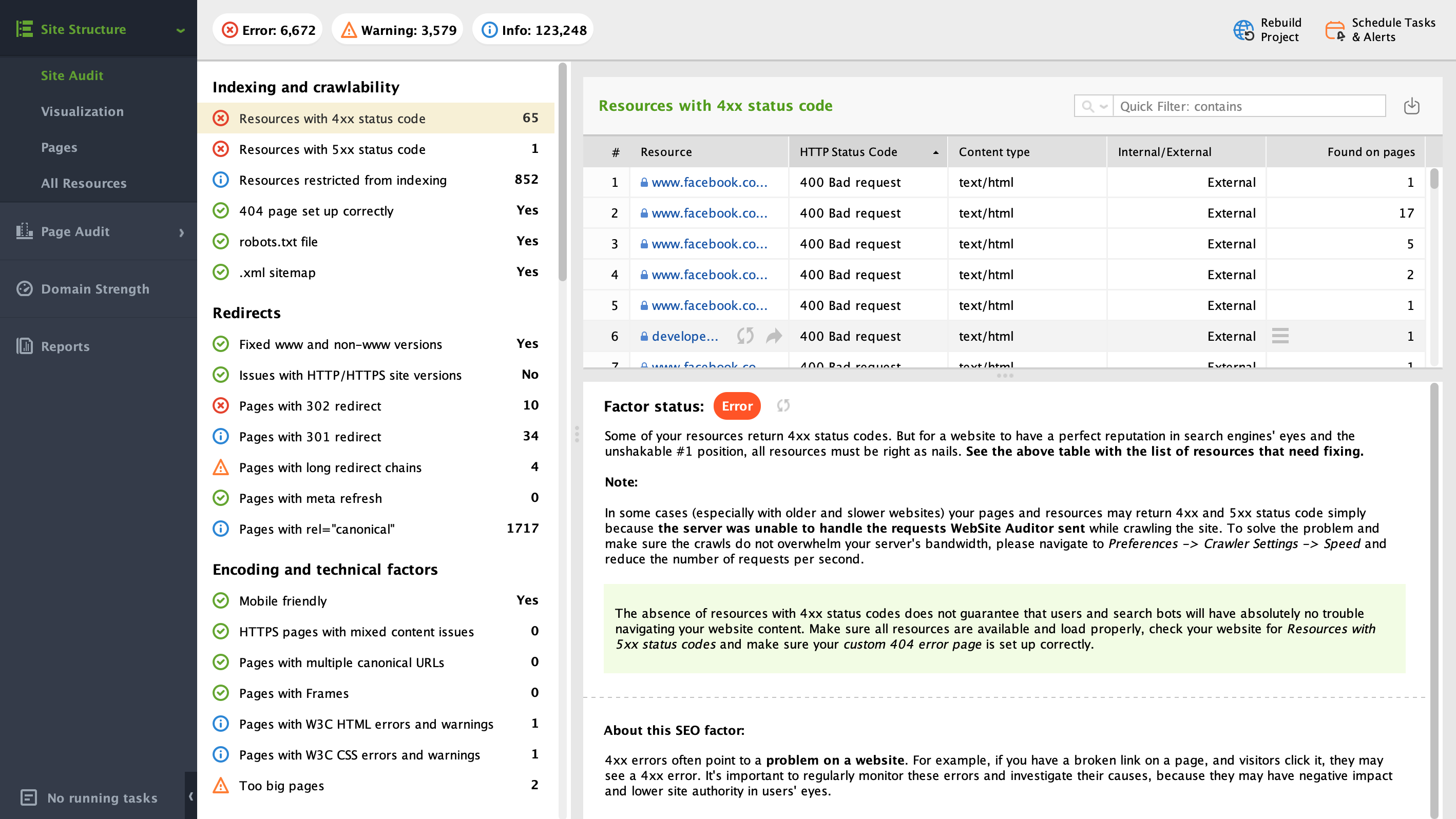
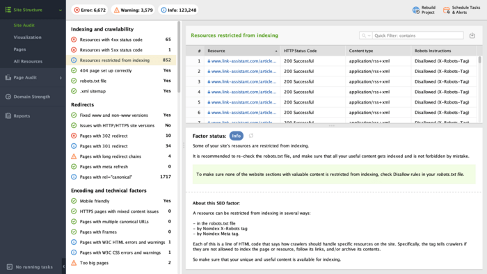
Search engines need to crawl your pages before they can rank them — and they don’t have infinite patience. If your site wastes crawl budget on filtered pages, pagination, or low-value duplicates, more important pages may never get indexed.
Start by checking:
With SEO PowerSuite’s WebSite Auditor, you can run a crawl simulation that shows which pages are indexable, which are blocked, and where canonical or meta tags might be misused.

Filters for size, color, brand, and price are useful for users — but risky for SEO. Left unchecked, they can generate thousands of thin or duplicate pages.
Best practices include:
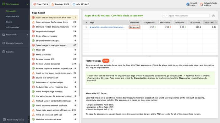
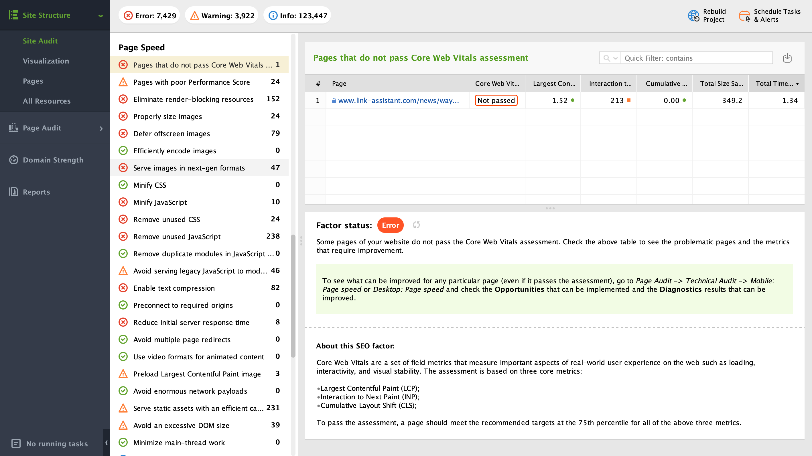
Page speed and mobile usability aren’t just UX issues — they’re SEO signals. Google’s Core Web Vitals update made this more important than ever.
To stay competitive, your ecommerce site should:
With WebSite Auditor, you can bulk-check all your pages for Core Web Vitals and page speed issues.
Structured data (Schema.org markup) helps Google better understand your pages — and unlocks rich results like product prices, ratings, and availability in the SERP.
Make sure you’re applying:
Strong technical SEO keeps your site running cleanly, efficiently, and indexably — which is essential when you're managing hundreds or thousands of pages.
Ecommerce SEO isn’t just about optimizing product and category pages. If you want to build topical authority, attract links, and rank for more than just transactional queries, you need a content strategy.
This doesn’t mean publishing blog posts for the sake of it. It means creating the right content to support your products — and help both search engines and users connect the dots.
When Google evaluates your store, it doesn’t just look at your product catalog. It looks at whether your site fully covers the topic.
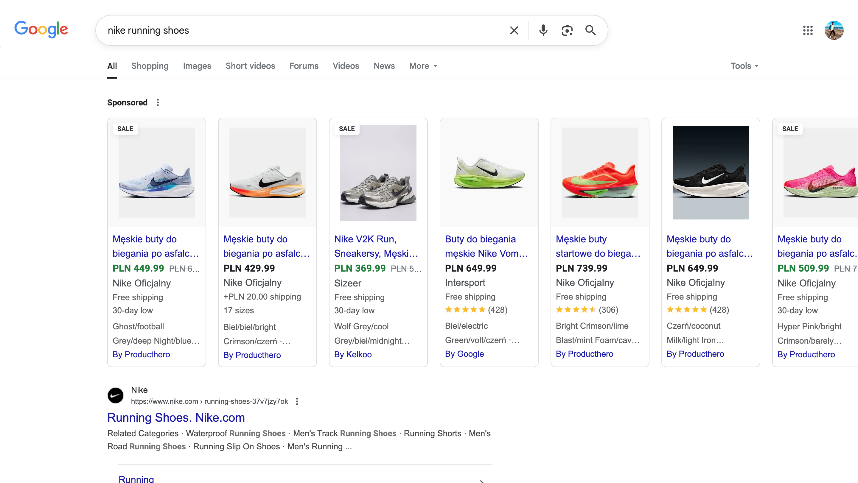
Let’s say you sell running shoes. Your product pages might cover the models, sizes, and pricing. But content like “how to choose running shoes based on foot type” or “best trail running shoes for beginners” helps you rank for broader queries, build internal links, and demonstrate expertise — all of which support your main money pages.
Informational content also gives you a way to target top- and mid-funnel keywords that are often ignored by product pages.


Here are some proven content formats that work especially well for ecommerce:
Not only do these types of content attract long-tail traffic, they also build internal linking opportunities that boost your product and category page authority.
Once you’ve identified a few content ideas, the next step is validating and optimizing them — and that’s where SEO PowerSuite’s Rank Tracker and WebSite Auditor come in.
Here’s how to use them:
This way, your content isn’t just helpful — it’s strategically aligned with your product catalog and SEO goals.
Creating content for ecommerce doesn’t mean becoming a media brand. It just means helping your customers (and Google) understand your products — and why your site is the best resource on the topic.
For ecommerce stores, building backlinks isn’t just about boosting domain authority — it’s about increasing visibility for key product and category pages that actually drive revenue.
But link building for ecommerce comes with its own set of challenges. You’re not a blog. You’re not a SaaS company. So earning links to product pages takes a bit more creativity.
Let’s break it down.
Even in 2025, backlinks remain one of the strongest ranking signals in Google’s algorithm — especially for competitive, high-value keywords.
Without links, your product pages might get indexed… but they won’t climb very far. And while great on-page SEO can get you part of the way there, backlinks are what signal trust and authority in your niche.
That’s especially important for newer stores trying to compete against big retail players.
Instead of chasing shady directories or link farms, focus on tactics that are sustainable — and actually support your brand.
Here are some strategies that work:
Link building starts with research — and that’s where SEO PowerSuite’s SEO SpyGlass comes in.
Here’s how to use it:
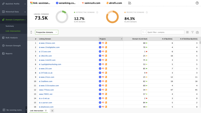
This saves hours of manual vetting and keeps your link strategy focused on what actually works.
In ecommerce, you don’t need thousands of links. But you do need the right links — to the right pages — from sources that align with your niche.
Done consistently, a handful of quality links to key category pages can move the needle more than a hundred random ones to your homepage.
Even if you run a fully online store, local SEO may still matter — especially if:
Many ecommerce sites overlook local SEO completely, which leaves a lot of opportunity on the table. Done right, it can help your store show up in local search results, Google Maps, and “near me” queries — all of which tend to convert well.
If your business falls into any of these categories, you should absolutely invest in local optimization:
Even just showing up in Google’s Local Pack for relevant keywords (like “electric bikes near me” or “kitchen appliance store Boston”) can drive highly qualified traffic.
Here’s what to focus on:
Optimizing your store is only half the equation. The other half? Knowing whether your SEO is actually working.
And for ecommerce, it’s not just about rankings. It’s about how SEO contributes to real business outcomes — traffic, engagement, and revenue.
Here’s how to track the right things and avoid vanity metrics.
Some SEO metrics look good on paper but don’t actually help your bottom line. Focus on what matters for ecommerce:
Tracking these over time helps you see whether your improvements are having real impact.
Not all pages behave the same. A blog post and a product page have different goals, user intents, and performance benchmarks.
Use segments in GA4 and tools like WebSite Auditor to isolate:
This helps you prioritize what to improve — and where you’re getting the most SEO return.
You might rank #1 for “blue widgets” on your office Wi-Fi — but what about your customers across the country?
That’s where Rank Tracker shines. It lets you:
You can even set up automated reports to stay on top of your progress without logging in every day.

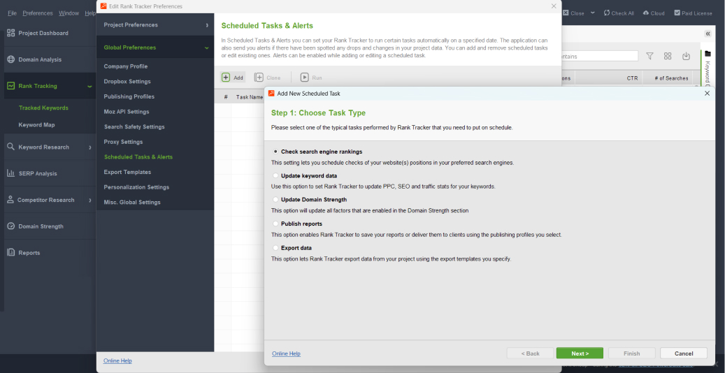
SEO isn’t a set-it-and-forget-it game. Schedule regular check-ins:
Using SEO PowerSuite across these intervals ensures nothing falls through the cracks — and your ecommerce SEO stays aligned with your store’s growth.
At the end of the day, SEO should do more than look good in a dashboard. It should help your store grow — page by page, ranking by ranking, and customer by customer.
Ecommerce SEO isn’t about chasing hacks or overnight wins. It’s about building a search presence that compounds over time — so that every new category, every product launch, and every blog post has a better shot at success than the last.
If you’ve made it this far, you already know that ranking in 2025 takes more than keywords. It takes structured site architecture, smart content strategy, clean technical execution, and the kind of topical authority Google now expects.
But it’s doable — especially if you’re methodical.
Whether you’re just starting out or looking to scale, SEO PowerSuite can help you keep every part of your strategy in sync. From auditing your category pages to tracking long-tail keyword clusters and spotting crawl issues before they cost you traffic — it’s all one platform.
So take what you’ve learned here, put it into action, and give your ecommerce site the organic growth it deserves.
When SEO becomes part of how you build — not just how you promote — everything gets easier.


| Linking websites | N/A |
| Backlinks | N/A |
| InLink Rank | N/A |